Adria is Paul M. Müller's top brand. How would you describe the brand?
Adria stands for reliability. With this product, every recipe succeeds reliably and the taste always remains the same. The brand conveys security - like a crane that you can hold on to. As a design agency, we consciously convey these values of familiarity, consistency and quality with the logo and design.
You have been working with Paul M. Müller for three years. Take us back to the beginnings...
When Thomas Schneidawind joined us three years ago, Adria was already well positioned, but there was a need to optimize other brands. Our aim was to develop a design that would clearly stand out from comparable products - with a high-quality look that would make the products stand out on the shelf. A versatile brand world emerged from the portfolio, which at the time was strongly focused on Adria.
How exactly did you achieve this?
New brands such as Avanti, Paolo Rossi and Donna Rosa were brought to life. The difference between the individual brands was clearly worked out. We developed a consistent brand identity for each brand. It was clear from the outset: to create desirability, we need a visual design that conveys both recognition value and high quality. Incidentally, quality is always at the heart of all brands - no matter how different the brands appear.
What was your goal in developing the brand?
We wanted to create a high recognition value. A customer who has used a product before should immediately think: "Adria again at last!" the next time they buy it. Thomas Schneidawind and his team ensure that the product is always of the best quality - we make sure that the design is so consistent and recognizable that the customer immediately knows that they are holding the "right" can in their hands.
Why is brand perception so important?
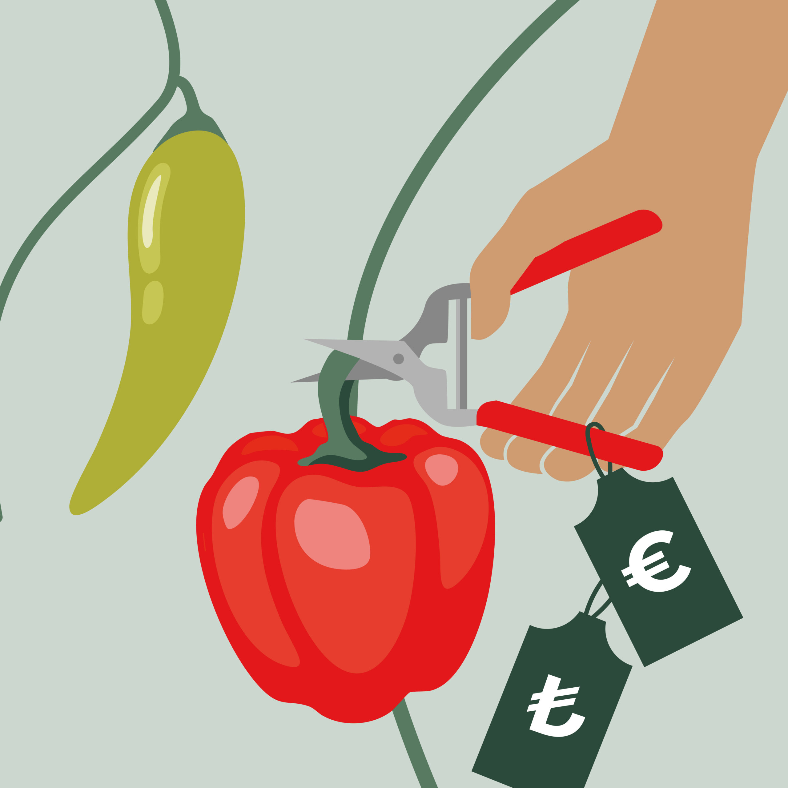
If you had a good product but now you can't remember which one was the right one, it doesn't help. Generic design not only ensures recognition or positive associations. If you want your product to stick in consumers' minds, you need to invest in a design that is linked to the quality of the product.
How do the brands differ in design?
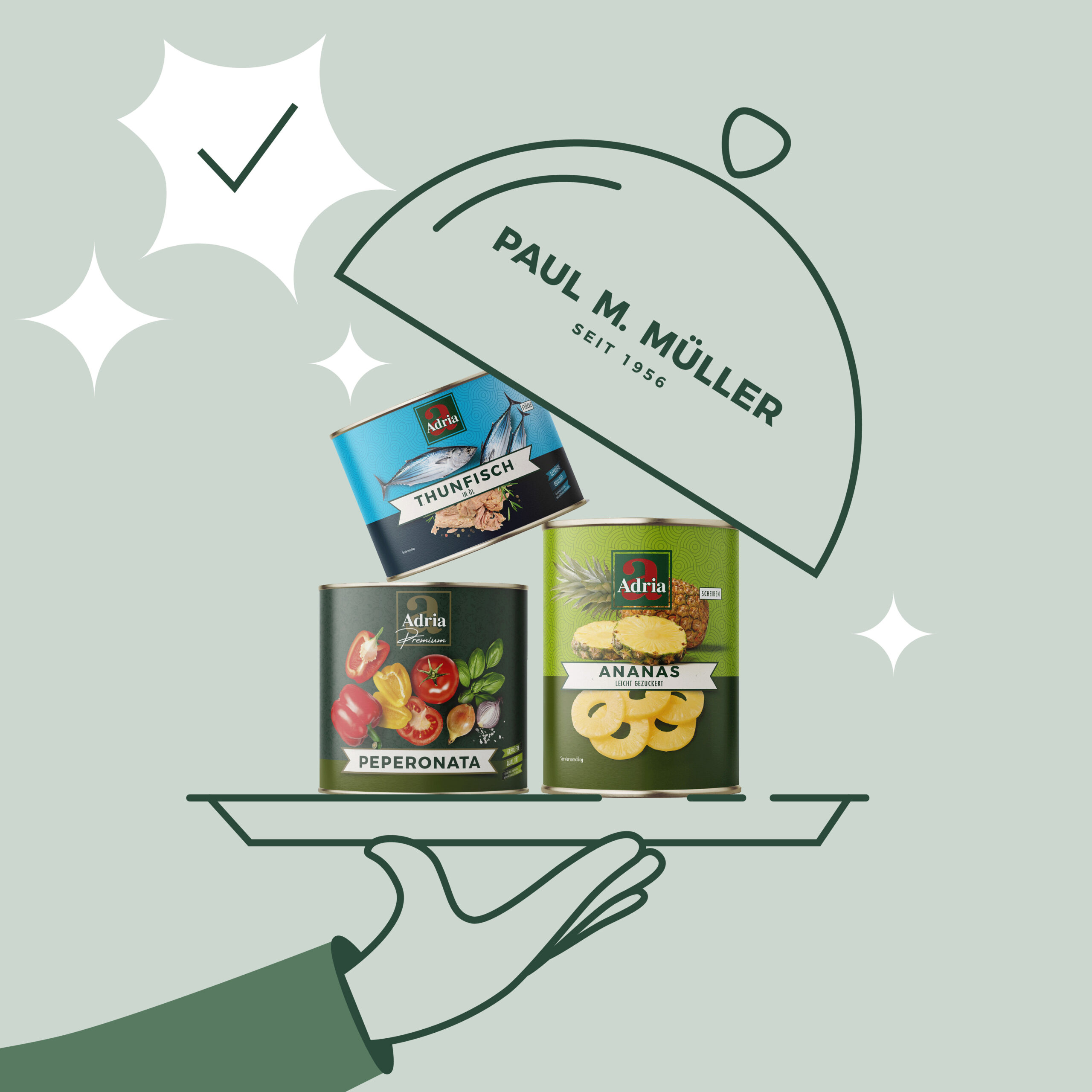
Every brand has its own visual language. Adria has a high-quality and emotional impact through images of fresh raw produce. Donna Rosa relies on simple, graphic elements - such as the striking, two-tone cans with clear illustrations that immediately catch the eye. The aim is to create a design that intuitively conveys to customers what product they are holding in their hands. A well-designed product creates a positive memory that also has a long-term effect.
Paolo Rossi is another brand that was developed with you. How did this come about?
Paolo Rossi was created as a spin-off (a kind of subsidiary brand) that focuses on high-quality peeled tomatoes. We wanted to create a brand that is aimed at pizzerias and Italian restaurants and build up an independent standing in the market in the long term. Especially in large cities, where the willingness to pay for high quality is high, the price only plays a subordinate role when shopping. What counts is the quality of the tomato, which enhances the taste of the pizza. Paolo Rossi is aimed at a quality-conscious environment and shows how flexible Paul M. Müller is when it comes to brand development.
Have the values of the Paul M. Müller company been incorporated into the various logos?
The brands are known for freshness and the design should reflect the freshness of the respective product. Of course, it would be tempting to position Paul M. Müller and its products as a traditional brand, for example by adding flourishes to the design, but values such as reliability, trust and expertise can also be made visible in the corporate culture and the commitment of the employees, for which - in the case of PMM - the design is inappropriate.
What does the term "brand maker" mean to you?
Together with Fabian Kretschmer and the entire team, Thomas Schneidawind has exceptional skills in bringing products to market quickly and has a keen sense of market needs. His excellent network of producers and the extensive expertise of his employees at Paul M. Müller in the development of brands make it possible to develop targeted brands for contract customers. Real brand makers. The brand makers are also intended to appeal to foreign manufacturers who want to successfully establish and market their possibly still unknown brand on the German market via the PMM platform. I know from Thomas Schneidawind: PMM creates real added value for producers through an international network, sophisticated logistics, an experienced sales team and professional quality assurance. There is only one central point of contact - everything from a single source. The producer does not even have to worry about debt collection. Successful examples such as the La Rosina, Citres and Maple Moon brands show how well this model works. Renowned labels such as Mutti have also found a reliable home with brand maker PMM.
What other special features are there with the Paul M. Müller brands?
The company appeals to a broad target group: The brands themselves are aimed at end customers - the buyers and partners are more associated with Paul M. Müller. Basically, you can compare it to a food company like Nestlé. People know the name Nestlé - but the products ultimately stand for themselves. It is therefore important to clearly emphasize the separation between Paul M. Müller and its brands in order to strengthen the identity of each brand.
Do you have a favorite logo - outside the Paul M. Müller company cosmos?
One logo that has fascinated me since I was a child is that of UPS. Despite the simple color scheme and design, UPS has built a strong brand identity that is characterized by the distinctive delivery truck and the coat of arms. This example shows how you can create a strong brand perception with simple means - worldwide.
About Fantomas and Lukas Nikol:
Fantomas is a design agency based in Munich and, according to Lukas Nikol, "specializes in everything that can be designed and perceived - from visuals that you can see and touch to spatial concepts such as trade fair construction." He also came up with the idea for Paul M. Müller's trade fair stand. Lukas Nikol: "The idea of setting up a giant box that you can walk around and use for meetings may seem simple, but it has a strong, tangible effect. The concept is based on a simple but powerful idea."